Background
With previous experience in design systems at Aperia, I got an opportunity to work as a lead designer for the design system project in BAEMIN, collaborating with Frontend and Mobile teams.
Previously, BAEMIN did not have a unified design system. Every project has its UI kit with its implementation, which leads to inconsistency and inability to reuse components between products. Swing (user application) and Pudding (merchant application) use their component implementation. Oloong (old merchant portal) and LatteHouse (BAEMIN staff admin) use MUI while Merchant Portal (new version) uses self-implemented components.
Goals
☑️
Harmonize experience
Enhance consistency with better user experience between products on both web and mobile.
⏰
Mitigate time
Collect and create reusable patterns, materials, and components for designers and developers.
📜
Clear documentation
One source of truth for designers (UI Library and documentation in Figma) and developers (npm packages and documentation in Storybook).
Task
As BAEMIN is a startup with limited resources, I played various roles in this project.
💬
Alignment
I conduct meetings between Design, Front-end, and Mobile to discuss how we will structure the design system to reuse it easily between platforms.
🗓️
Process management
I acted as an “amateur” project manager splitting tasks and tracking tasks’s process.
💪
Execution
I worked as a main designer and developer in this project, contributing to the UI Library in Figma and npm packages.
Structure
Generally, the design system’s UI libraries in Figma and npm packages will be consistent. There would be three main libraries/packages: Foundation, Mobile, and Web. The mobile and web will extend the foundation and include its platform components.
The product will use the corresponding platform package while having its product components.
The design system source code is a mono repo using Nx to make it easier to share code between packages.
Foundation
The foundation is the most important part of the design system. The main task in this area is to collect all the materials being used in all the products and organize them into a better structure.
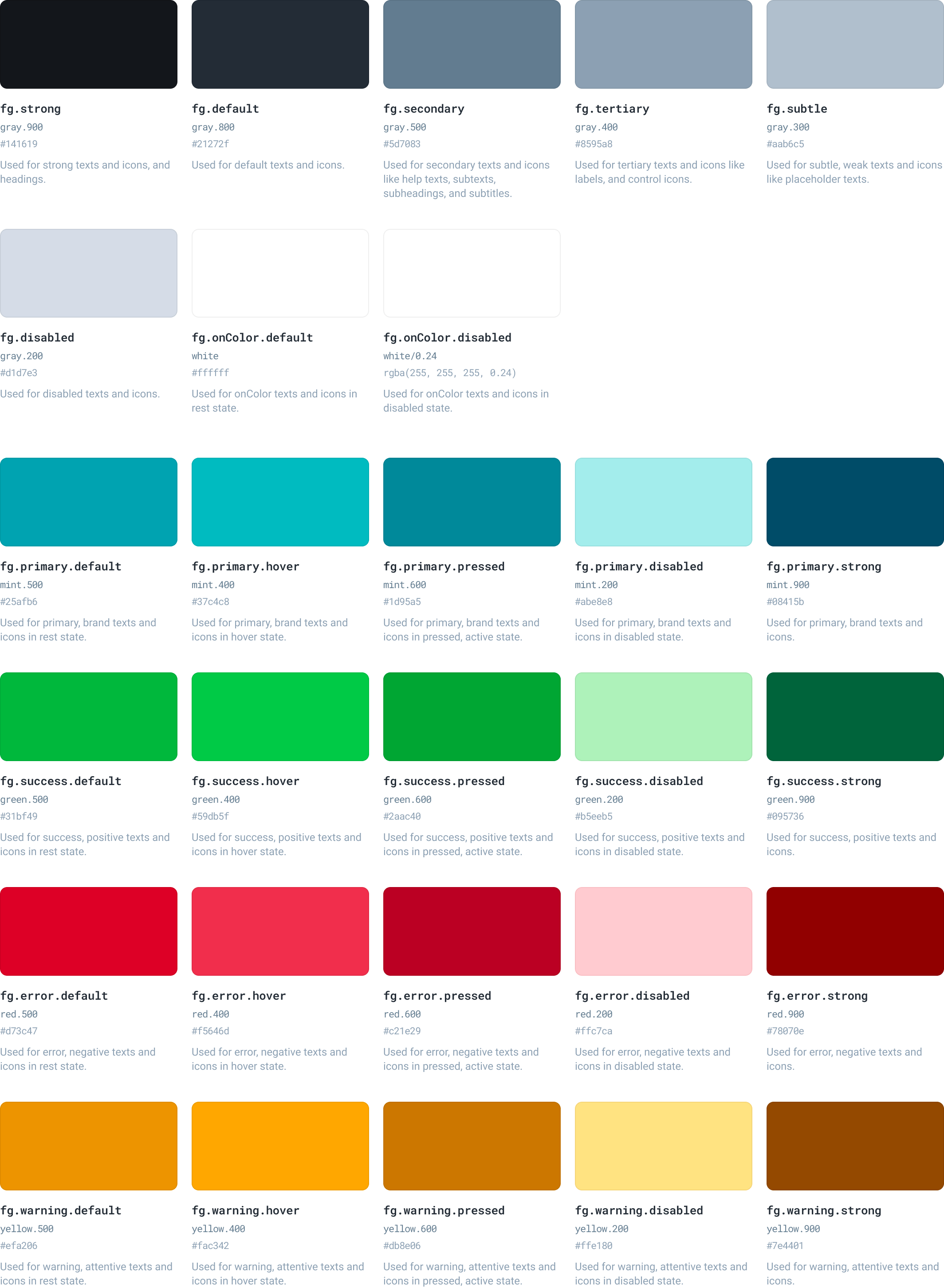
Color
Current problems
- Colors are fragmented into 2 main systems (one used in the user app, the other used in the merchant app).
- Although in the merchant app system, colors are organized into palettes with levels, colors in the same level do not have the same contrast, making it not predictable to ensure contrast for color combination.
- The design tokens concept is used but it’s not effectively organized, especially for dark mode.
Refinements
I map and merge colors from 2 main systems. All the colors used are named by level and adjusted for better contrast for predictable usage. Also, they are organized into design tokens by a logic scheme to make it easier to choose the correct color and enable theming (like dark mode).
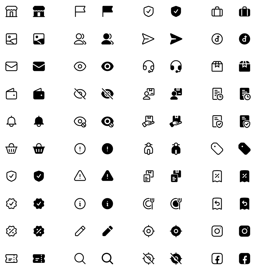
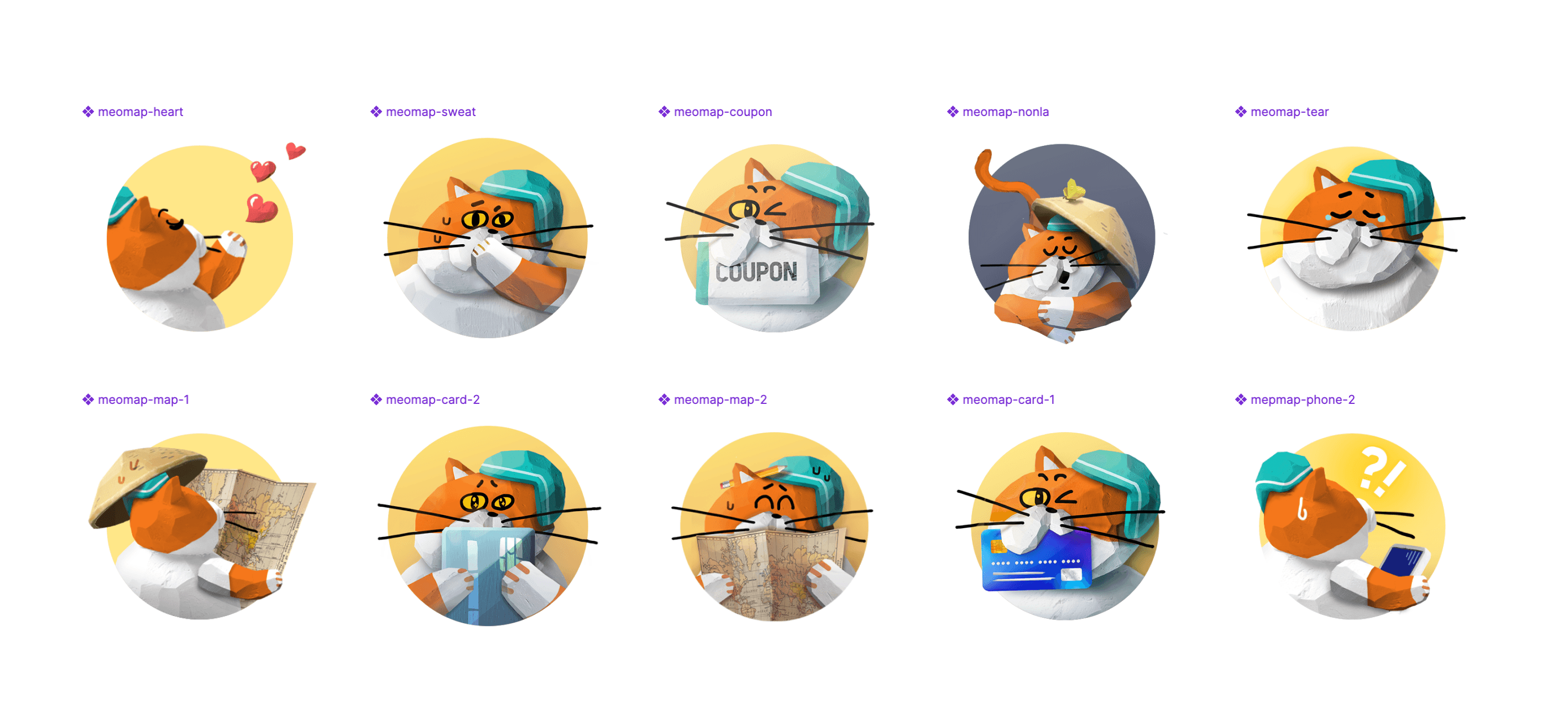
Illustrations & Icons
Current problems
- Icons are not consistent with different styles of stroke and fill without any guidelines.
- Illustrations are not constructed using the same ratio and frame, so their size is hard to control for consistent sizing.
Refinements
Icons are collected from the products and redrawn based on Hero icons (with many custom icons). There is a simple guideline to make them consistent.
The icons are then generated into React and React Native components (using SVGR) to make them usable in products. Developers don’t need to export icons, which may lead to duplication, disorganization, or incorrect sizing.
I also make an icon listing page in Storybook for easier icon searching.
In addition to icons, I collect all the illustrations around the products and group them by usage purpose. Also, make them available in the package for implementation usage.
Web
Typography
We decided to put Typography at the platform level instead of the foundation level because the typography styles in web and mobile products are quite different. In both, I collect and group similar text styles being used in products.
For example, some text styles use 15px and 16px font sizes, so we decided to merge them and use only 16px.
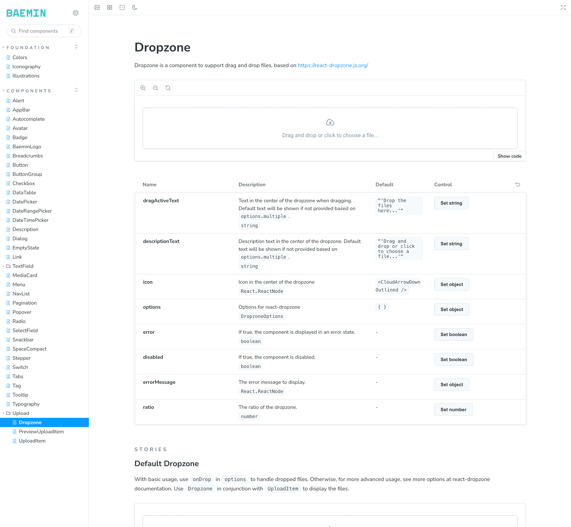
Components
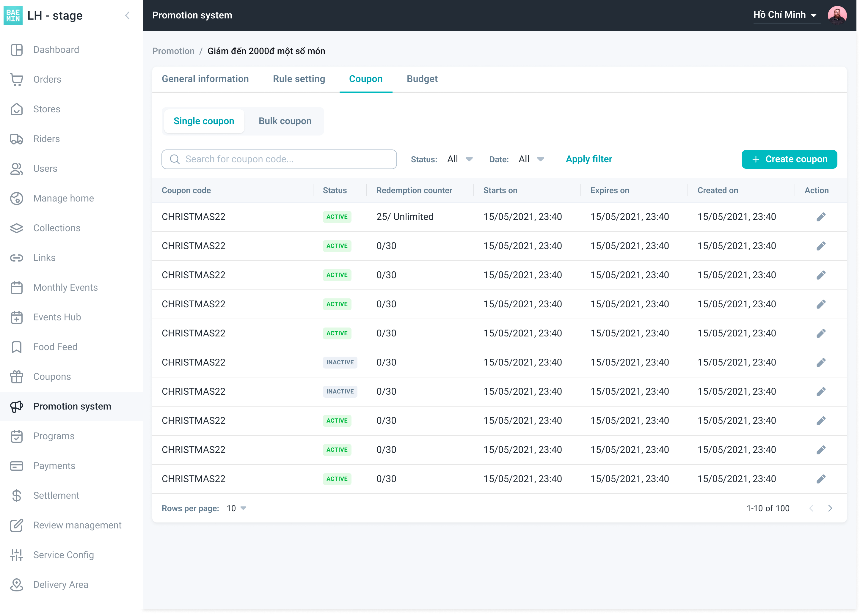
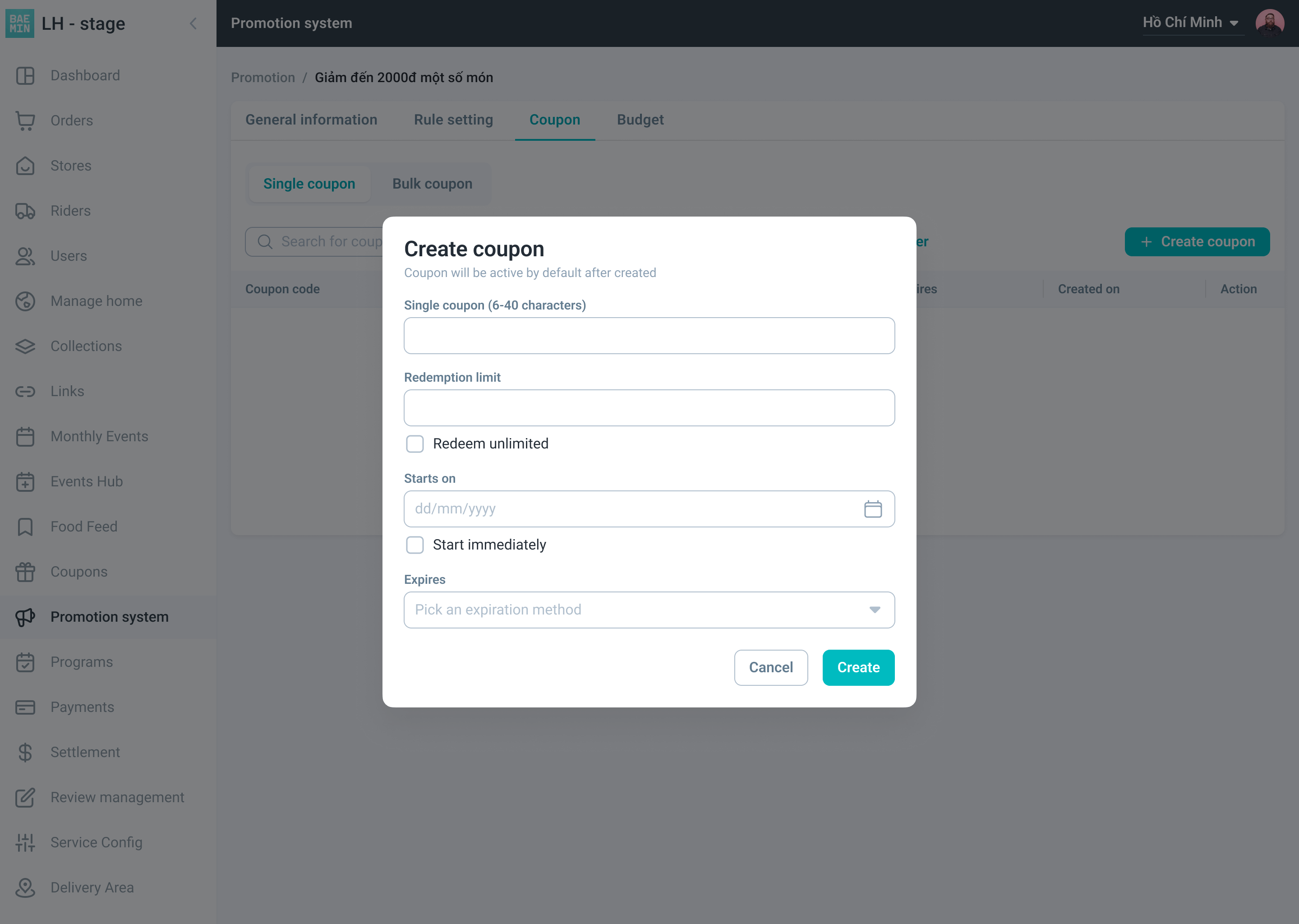
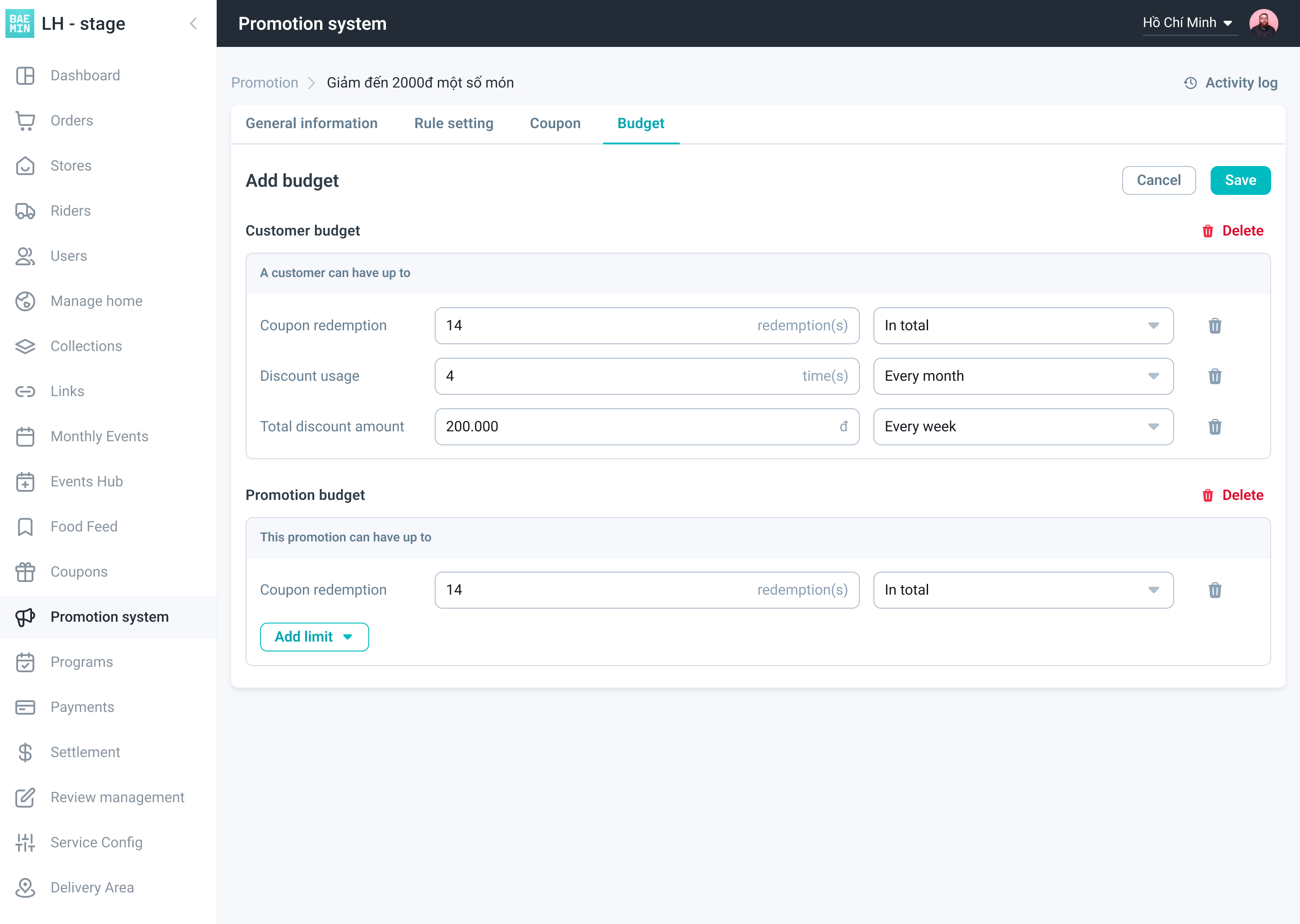
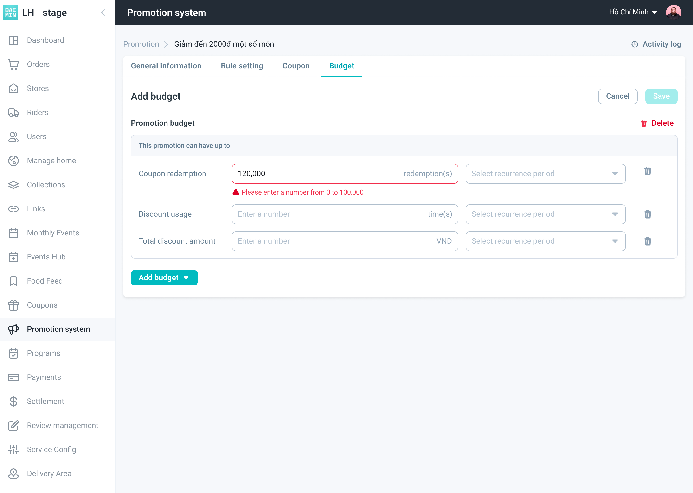
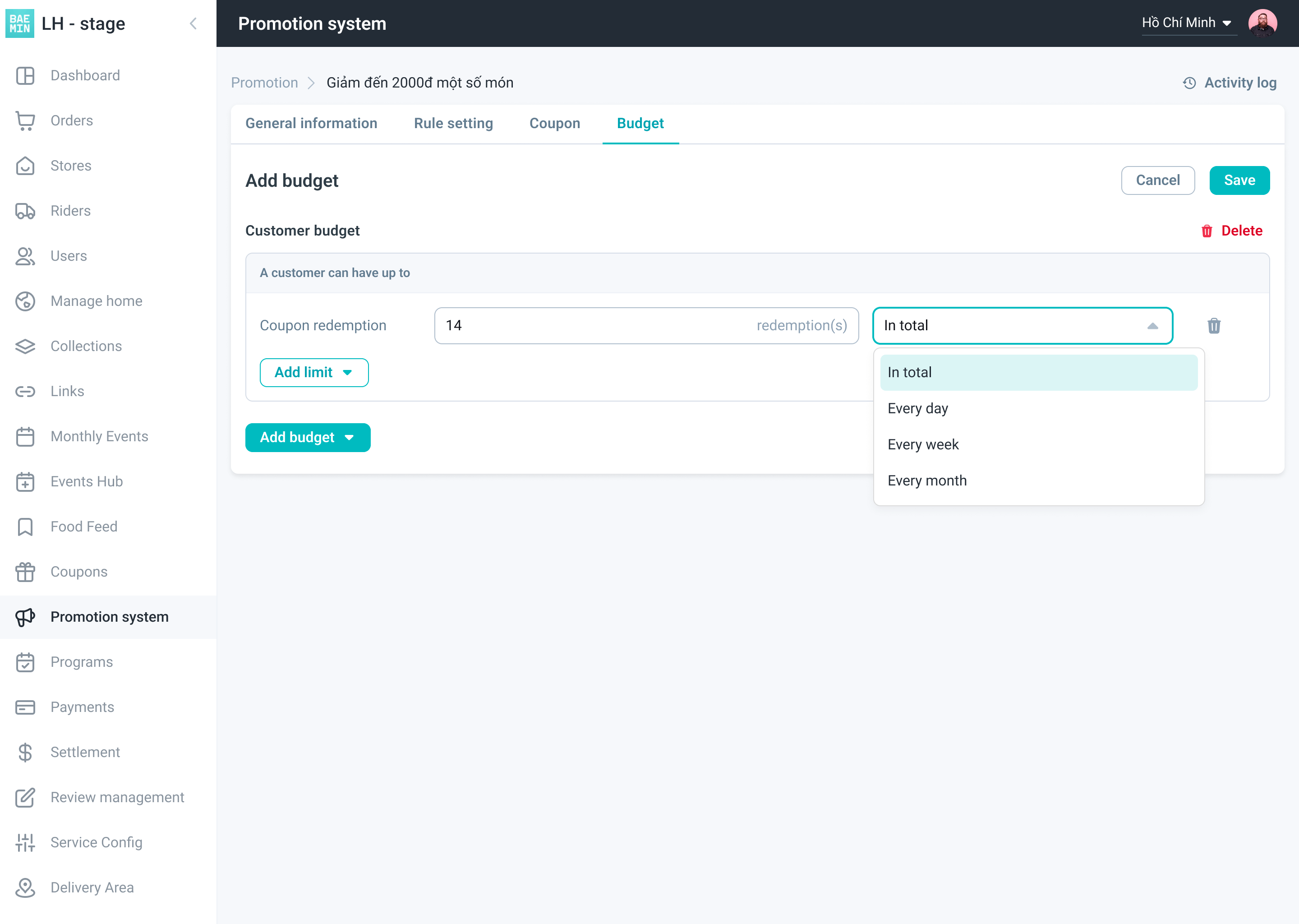
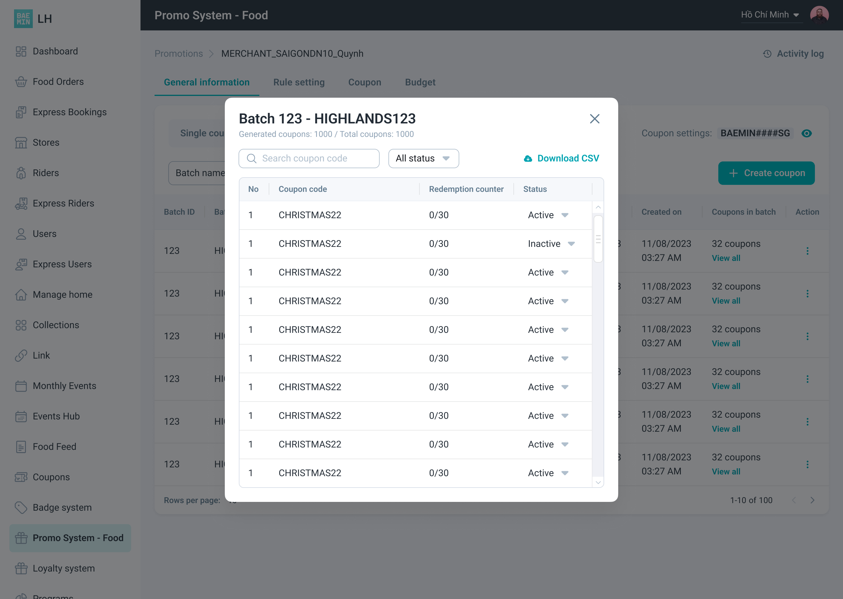
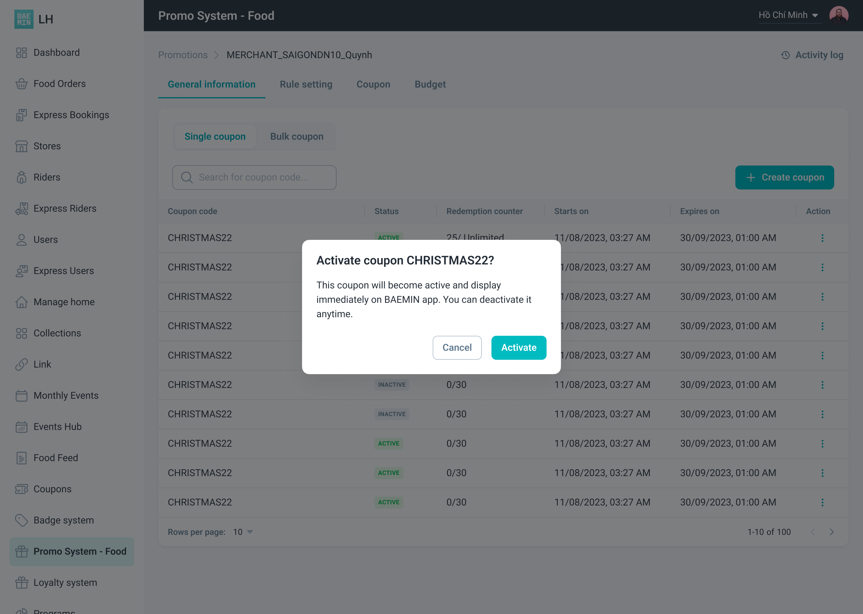
Most big projects were using the same MUI UI Library, so I crafted components based on MUI with the typography and colors from the design system’s foundation. Additionally, there are also some advanced components such as Table, DatePicker, and Upload that I implemented by myself with some support from the Front-end team.
Results
Before BAEMIN shut down 🥹, we had completed the design system web version and applied it to two products (Olong and LatteHouse), harmonizing the web experience at BAEMIN with better usability and less implementation time.