What and why
Pixel Design System is the design system used for Aperia products, which are mainly focused on financial and data management systems. It consists of below parts:
- UI Design and UI Kit in Figma and Sketch.
- DSM Documentation for Behavior and Interaction.
- Storybook documentation.
- ReactJS components.
The goal is to enhance the consistency between designs through products and between design and implementation. Also, mitigate the time for implementing the user interface and have one source of truth for design and development documentation.
☑️
Enhance consistency
🥹
Mitigate implementation time
📜
Clear documentation
Design Foundation
I joined the team in the beginning and created the foundation for the design system including the color and typography system for visual language.
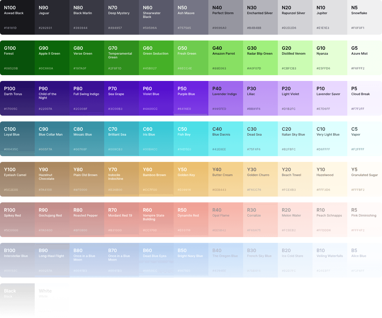
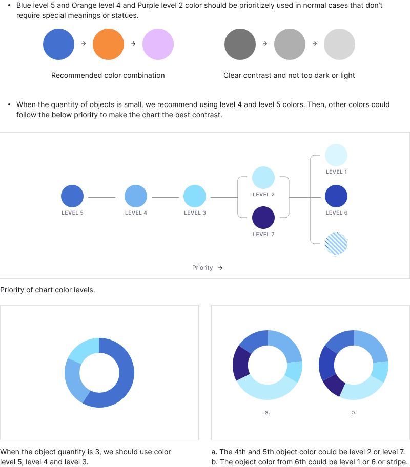
Color
Define a color palette and color using guide to use consistently within components and pages and meet the contrast for accessibility (WCAG).
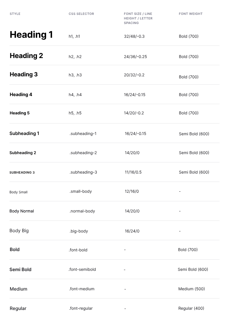
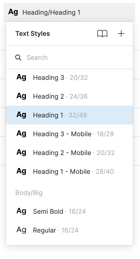
Typography
Define responsive typography styles (for design-tool UI kit and CSS utilities) for consistency between design and development
Copywriting
I work with technical writers to document the voice and tone we should use in our products and some common-case recommended verbiage.
Components
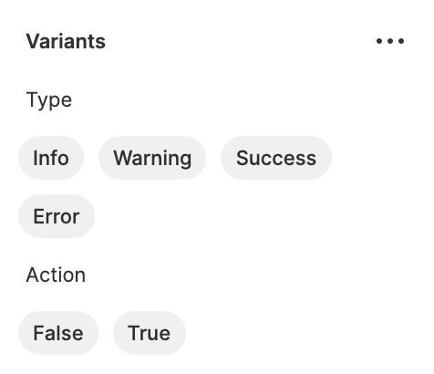
I define how components look and work, then set them up in Figma and Sketch. On the other hand, discuss with developers to unify component APIs to make them consistent with Figma Variants.
During this process, I make rapid prototypes in HTML/CSS/JS to explain complex concepts (like Design Tokens or Popover responsiveness) and sometimes help implement the React components.
Design Tokens concept
Documentation
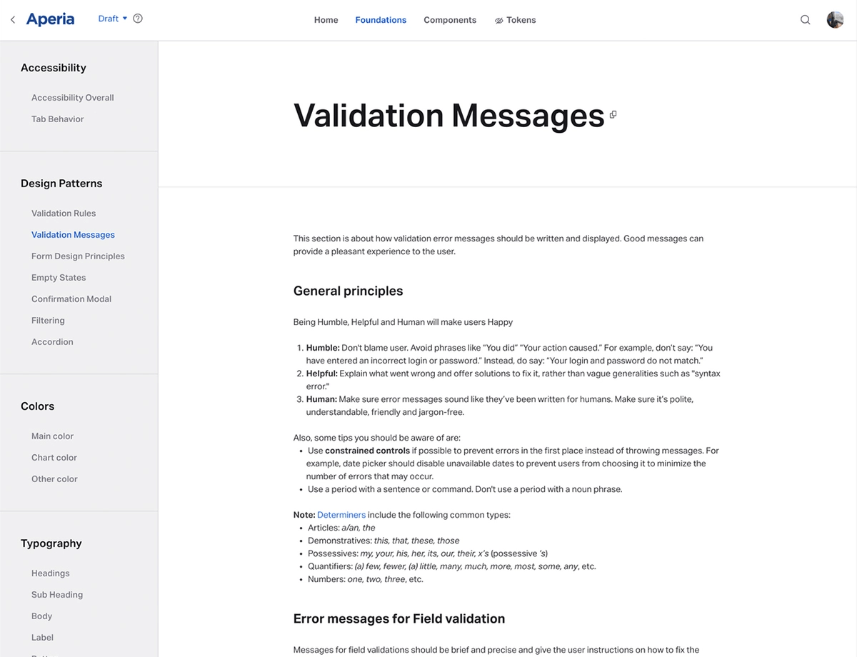
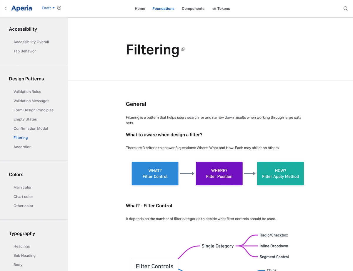
In the main documentation, we document all UI specs and behaviors of components to make sure all members will understand and be on the same page.
In the Storybook documentation, we document the component APIs and list out some common use cases, what should developers notice, and what props to use in each case.
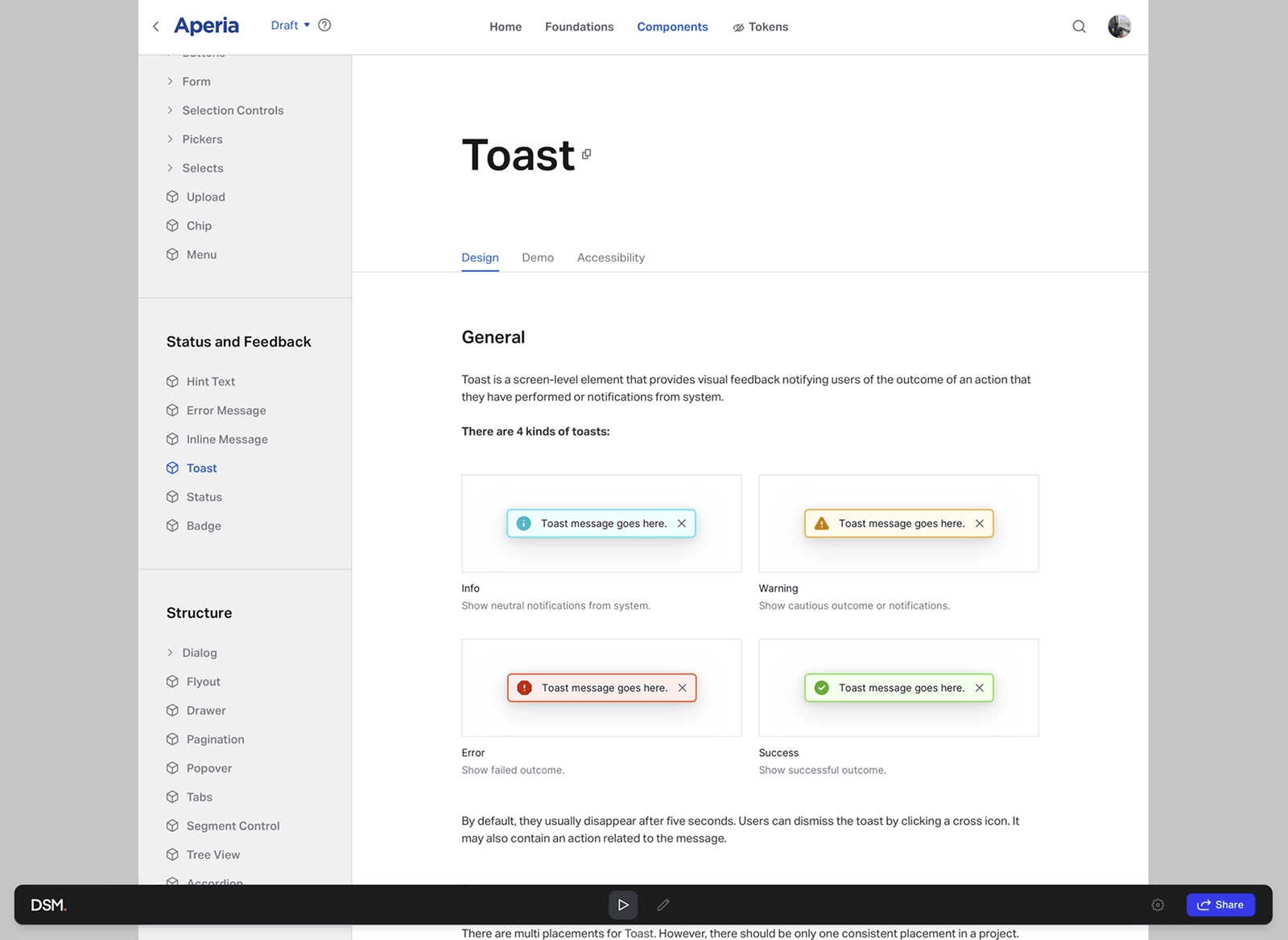
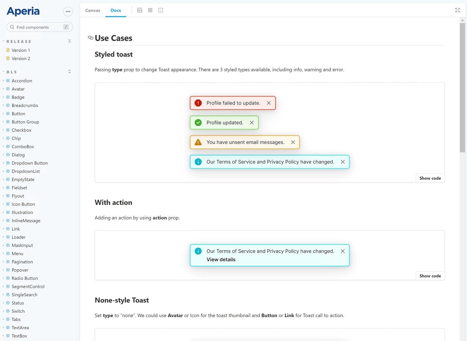
Component APIs
Component APIs are synced between design and source code. So we could speak the same language. Although there are some differences in type, such as action in Figma is boolean to turn on/off the action frame (support override to other components), meanwhile, the action prop in React components supports passing React Node.
Results
The design system has been used in several Aperia products, including Tapestrii and PCI. It has been proven to be effective in enhancing the consistency between designs and implementations. Also, it helps to reduce the time for implementing the user interface and have one source of truth for design and development documentation.
Note
Some private materials could not be shared publicly. You can contact me via hi@auduongtuan.com for more information.